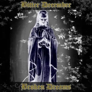
My Art Styles
These aren’t just styles. They’re windows I’ve learned to open.
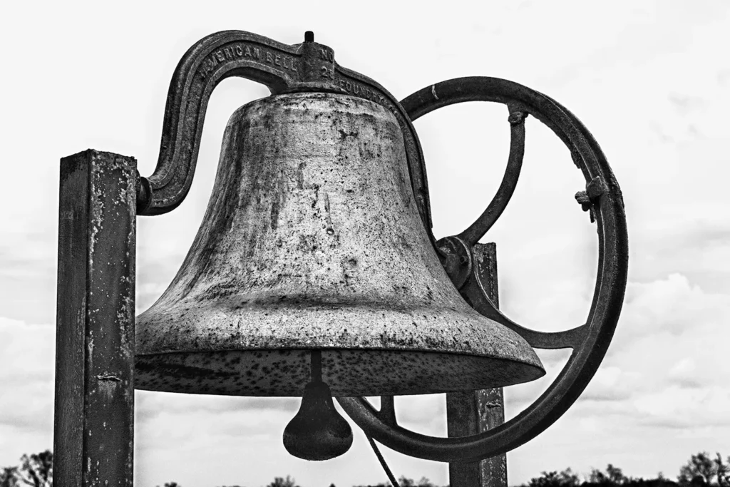
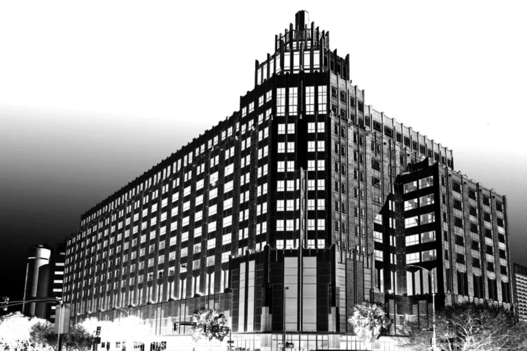
Monochrome Photography
I see in contrasts first. Light and shadow aren’t opposites — they’re the structure the world hangs on. Monochrome removes the noise, leaving only the bones: form, texture, and the spaces between. Without color to flatter or distract, the truth of an image is exposed. This is where I began, and it’s still where I return when I want to see the world clearly
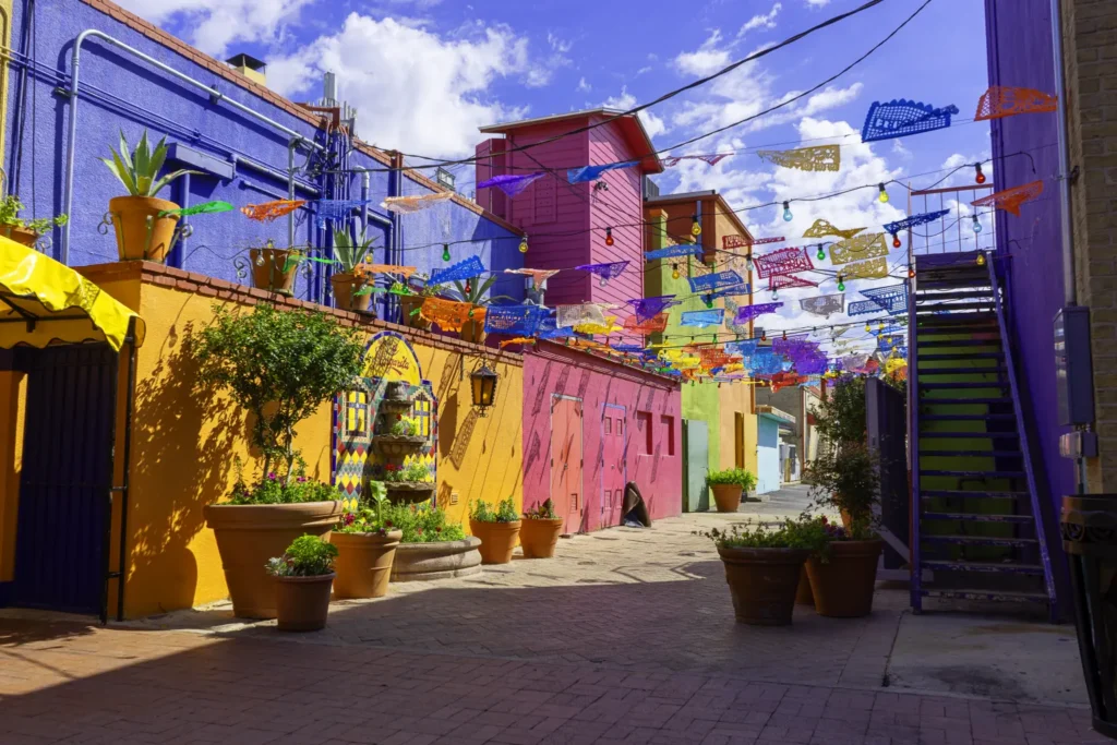
Color Photography
I use color when it tells the truth better than shadow alone. Saturation can wound or heal, depending on how it’s held. I look for palettes that carry memory—faded storefront paint, rusted steel against turquoise sky—moments where hue isn’t decoration but a fingerprint. Color, when it matters, is proof something lived here.
Sculpted Photography
These begin in the lens but don’t stop there. I push, pull, and bend until the image carries the weight it couldn’t hold on its own. Sometimes that means deepening shadows; sometimes, pulling out a texture hiding in plain sight. This isn’t falsifying—it’s revealing the emotional geometry the raw frame only hinted at.
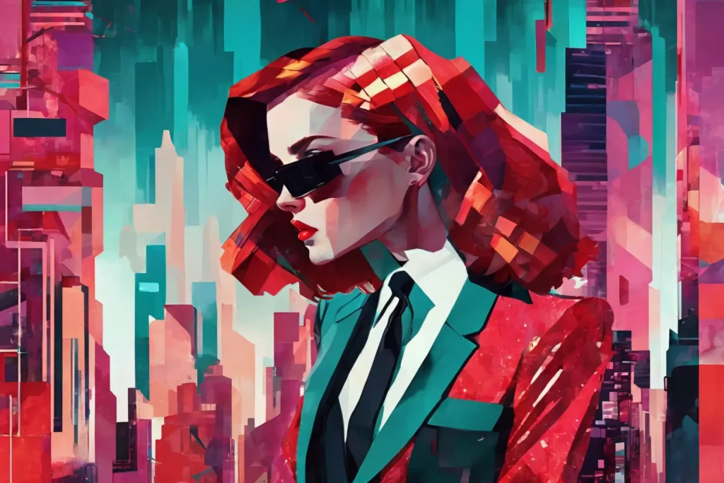
NeoDeco Glitchwave
Geometry in rebellion—clean lines fractured by noise, glamour threaded through static. This style builds on Art Deco elegance but lets the edges bleed, colors burn, and patterns glitch. It’s a collision between the precision of the past and the chaos of the digital present, a reminder that beauty can survive distortion.
Sabattier Forms
Light inverted into strange truth. Shapes emerge in ghostly tones, familiar yet untethered from their source. Sabatier is about revealing what the naked eye skips over—making the ordinary uncanny, giving weight to outlines and shadows as if they’re the subject themselves. It’s not a negative, it’s a parallel reality.
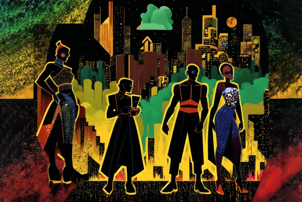
NeoFunk
Heavy ink, hard edges, and unapologetic color. This style is all rhythm—modular skylines, femme fatale silhouettes, and saturated hues that feel like a needle drop on vinyl. It’s retro, but not nostalgic. Every block of color is a beat, every line a riff, pulling the eye into its own kind of groove.
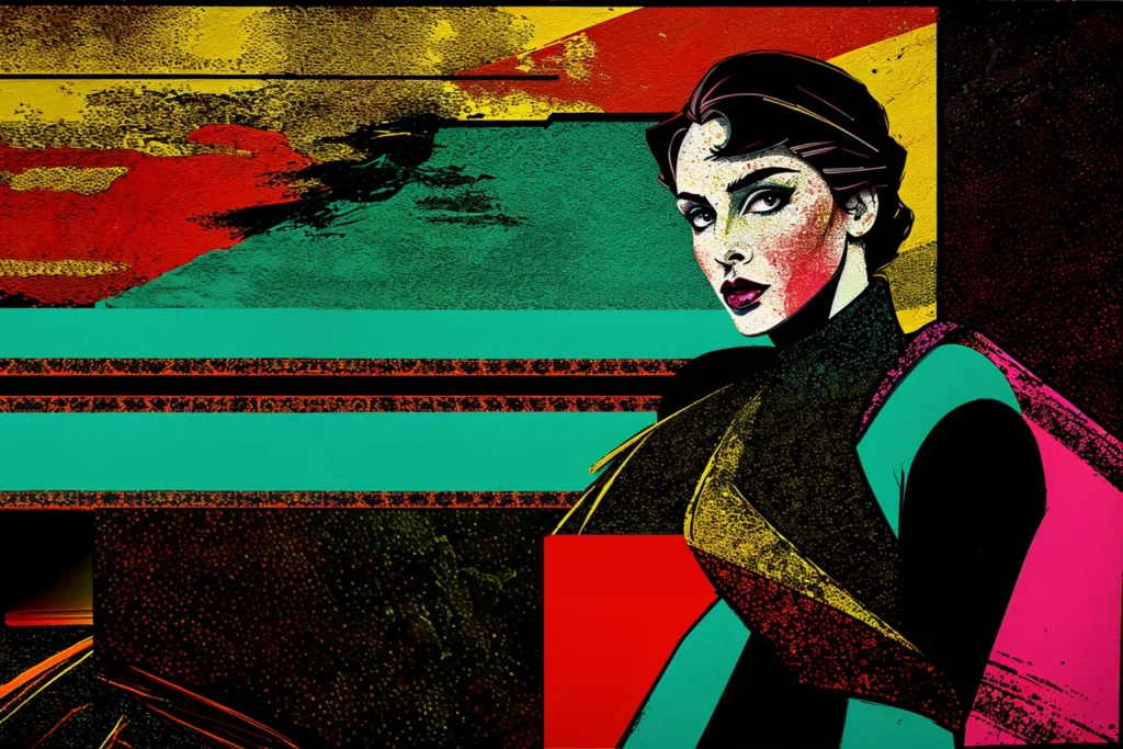
Vector Vogue
Flat color, bold line, and geometric confidence. Vector Vogue channels the spirit of 80s graphic design—think Patrick Nagel meets pop art editorial. Subjects emerge with deliberate poise from stylized scaffolds of pastel or jewel-toned shapes, cleanly lit and razor-defined. There’s no blur, no hesitation—every angle is intentional, every color a statement. This style doesn’t just evoke fashion—it embodies it, like a magazine cover caught in a frozen moment of power and poise.
Commissioned Works
These pieces carry someone else’s spark. A vision, a request, a challenge—reshaped through my lens and hands. Commissioned work is collaboration at its most distilled: a merging of perspectives, bound by trust that I’ll not only meet the request but uncover something neither of us expected.
Personal Works
Here is where I wander. No request, no brief—only curiosity. Personal work is where I test edges, follow impulses, and make images I can’t explain until they’re finished. It’s the heartbeat beneath the rest of the work, the place where everything else begins.